| Author |
Message |
| Registered: March 19, 2007 |  Posts: 700 Posts: 700 |
| | Posted: | | | | Did some scans for the UK Clone Wars, and want your oppinion on witch one is prefered into the profile? Alt 1. 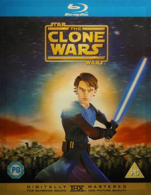 Alt 2. 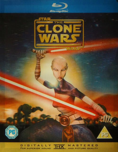 Alt 3. 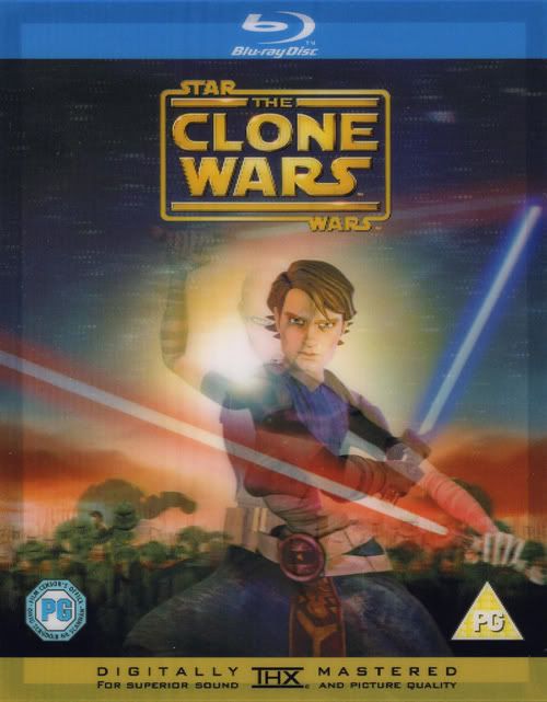 I am myself leaning towards alt 2. as it is spes for the slip, althou the alt 1. gives the same picture as the coverart itself and may be easier to swallow for those who buy it later and doesn't get the slip... | | | | We are all at the same age, only at different time... |
|
| Registered: March 14, 2007 | | Posts: 3,830 |
| | Posted: | | | | . | | | | Sources for one or more of the changes and/or additions were not submitted. Please include the sources for your changes in the contribution notes, especially for cast and crew additions. | | | | Last edited: by ? |
|
| Registered: March 14, 2007 |  Posts: 868 Posts: 868 |
| | Posted: | | | | Quoting Giga Wizard: Quote:
there should be no choice? if the first release has the slipcover, it should be the slip cover:
from our beloved rules:
Quote:
If a DVD is packaged in a keep case, within a slipcase of some kind, scan the Cover Images from the outer slipcase. If, however, the Slipcase is reflective, and the inner cover art is identical, use the Keep Case art to scan, as it will give a better quality image.If a title is re-released with the same UPC, but different cover images do not contribute the new images. This includes cases where a DVD was initially released in a slipcase, which was later removed. As explained in the introduction you may use your personal images in your local database, but they will not show online.
as i understand they are all from the slipcover (one of those '3-D'/moving type of picture). 1 and 2 are one stance and the 3 seems to be sort of in 'motion'. I'd prefer the first if that is the picture you'd get without slipcover (if i understand correctly). Paul |
|
| Registered: March 14, 2007 | | Posts: 3,830 |
| | Posted: | | | | . | | | | Sources for one or more of the changes and/or additions were not submitted. Please include the sources for your changes in the contribution notes, especially for cast and crew additions. | | | | Last edited: by ? |
|
| Registered: March 19, 2007 |  Posts: 700 Posts: 700 |
| | Posted: | | | | Quoting paulb_99: Quote:
as i understand they are all from the slipcover (one of those '3-D'/moving type of picture). 1 and 2 are one stance and the 3 seems to be sort of in 'motion'. I'd prefer the first if that is the picture you'd get without slipcover (if i understand correctly).
Paul Exactly alt 1. is the "almost" same art as inside. Quoting Giga Wizard: Quote:
could fall back on the reflective issue then and go for the inside cover, quality would be better and state the why in the contribution note. There is the banner issue with the innercover, as the banner is gone with slip ticked and there are other differences, made one with the banner from Ken but din't like that myself so thats why it was left out...  woderded to get the thx in at the bottom also, but it would not be the correct scan anyway... 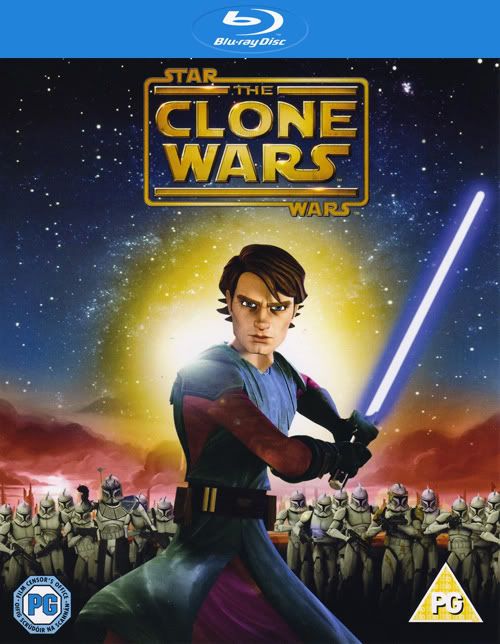 EDIT: Alt 5. somthing like this... (couldt help myself...)  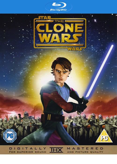 | | | | We are all at the same age, only at different time... | | | | Last edited: by oleops |
|
| Registered: May 18, 2007 |  Posts: 232 Posts: 232 |
| | Posted: | | | | I would go with the one you usually see when you look at it. If that is varying and one is similar to the inside cover art, I would go wit that one. But usually the 3d-covers seems to show one image unless you look from a certan angle.
But I am a little bit curious to how you manage to scan different viewing angles? | | | | Last edited: by Gemini76 |
|
| Registered: March 19, 2007 |  Posts: 700 Posts: 700 |
| | Posted: | | | | Quoting Gemini76: Quote:
I would go with the one you usually see when you look at it. If that is varying and one is similar to the inside cover art, I would go wit that one. But usually the 3d-covers seems to show one image unless you look from a certan angle.
But I am a little bit curious to how you manage to scan different viewing angles? They are actuallly so close together so it depends if you are right eye dominated or the oposite... A friend of mine stood in the shop wondering wich one to pick... of the two on the shelf...  The "scans" are actually pictures and some CS work on the geometric. | | | | We are all at the same age, only at different time... |
|
| Registered: April 4, 2007 |  Posts: 887 Posts: 887 |
| | Posted: | | | | Quoting oleops: Quote:
A friend of mine stood in the shop wondering wich one to pick... of the two on the shelf... 
that's hilarious  | | | | - Jan |
|
| Registered: May 18, 2007 |  Posts: 232 Posts: 232 |
| | Posted: | | | | Quoting oleops: Quote:
They are actuallly so close together so it depends if you are right eye dominated or the oposite...
Then I would maybe prefer the 3rd one, as there it's obvious it's a 3D image and you can see both versions. |
|
| Registered: July 31, 2008 | Reputation:  |  Posts: 2,506 Posts: 2,506 |
| | Posted: | | | | Quoting Gemini76: Quote:
Quoting oleops:
Quote:
They are actuallly so close together so it depends if you are right eye dominated or the oposite...
Then I would maybe prefer the 3rd one, as there it's obvious it's a 3D image and you can see both versions. Although I agree with you that it shows off the lenticular nature of the cover, I submitted one like that a few months back and the general opinion then was to have the singular image. |
|
| Registered: May 18, 2007 |  Posts: 232 Posts: 232 |
| | Posted: | | | | Yeah. One guy tried to contribute a 3D scan recently, of a slip cover. Got yes votes, but got rejected. The image allready in the database was clearer, but then it was of the inside cover. Got approved on the 2nd or 3rd try though. Anyway I would generally vote yes to a plain scan, even though it's not very clear. I'm not sure I'd vote yes if the cover image was tampered with and as with this; only showed half the image. I like this one: UPC 7-036988-019935, where the inside cover is yellow with lots of animals, which is on the slip as well when you tilt it. But when you scan it, it appears only with the blue empty version. Think it's the same thing. Think some updates in the rules would be good here  | | | | Last edited: by Gemini76 |
|